When I begin a new project, half the battle is starting on the right foot. I imagine others feel the same, as they navigate countless tools and blogs trying to work out what is new and recommended. However, no matter what problem we’re trying to solve, a few elements are always necessary, and one of them is a grid system.
Responsive behavior
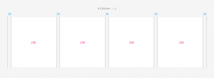
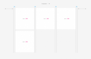
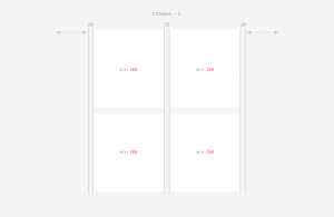
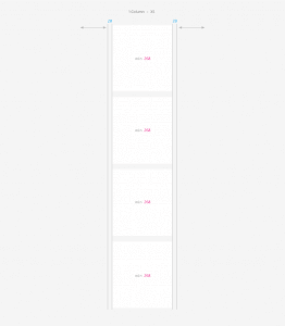
The grid supports mobile devices and has the following four break points:
Large (desktop) 1171px and up
Medium (tablet landscape) 1170px – 889px
Small (tablet portrait) 888px – 579px
Extra Small (mobile) 578px – 268px
In most cases, a home page will consist of several “sections” (eg. Blog, News, Images …) and a sub from a content block with or without a sidebar on the right.
As the screen is smaller, the blocks positioned on the homepage under another. On a sub-block of the content remains the top stand. The elements of the sidebar will abide by under the block content.
With these basics in mind lets do some coding.
HTML5
HTML5 is the latest evolution of the standard that defines HTML. The term represents two different concepts. It is a new version of the language HTML, with new elements, attributes, and behaviors, and a larger set of technologies that allows the building of more diverse and powerful Web sites and applications. This set is sometimes called HTML5 & friends and often shortened to just HTML5.
!DOCTYPE html>
  <html>
    <head>
      <meta charset="UTF-8">
      <meta name="viewport" content="width=device-width, initial-scale=1, maximum-scale=1">
      <title>Title of the document</title>
      <link rel="stylesheet" href="css/Style.css">
    </head>
  <body>
    <div class="block-holder">
      <div class="sp-block">
        <div class="shadow">
          <div class="app-block"><p>Block 1</p> </div>
          </div>
        </div>
      <div class="sp-block">
        <div class="shadow">
          <div class="app-block"><p>Block 2</p> </div>
          </div>
        </div>
      <div class="sp-block">
         <div class="shadow">
          <div class="app-block"><p>Block 3</p> </div>
          </div>
        </div>
      <div class="sp-block">
        <div class="shadow">
          <div class="app-block"><p>Block 4</p> </div>
          </div>
        </div>
    </div>
  </body>
</html>
CSS3
CSS3 is the latest evolution of the Cascading Style Sheets language and aims at extending CSS2.1. It brings a lot of long-awaited novelties, like rounded corners, shadows, gradients, transitions or animations, as well as new layouts like multi-columns, flexible box or grid layouts. Experimental parts are vendor-prefixed and should either be avoided in production environments, or used with extreme caution as both their syntax and semantics can change in the future.
body {
  background: #f5f5f5;
}

.block-holder {
  list-style: outside none none;
  margin-left: -20px;
}

.sp-block {
  box-sizing: border-box;
  display: inline-block;
  float: left;
  margin-bottom: 20px;
  min-height: 1px;
  padding-left: 20px;
  vertical-align: top;
}

.shadow {
  box-shadow: 0 1px 2px 0 rgba(0, 0, 0, 0.1);
}

.app-block {
  background-color: #ffffff;
  padding: 8em 0;
  text-align: center;
}

/* Make the view port responsive, by splitting up the blocks.*/

/* 4 col */
@media only screen and (min-width:1171px) {
  .sp-block{width:25%;}
  .sp-block.two-col{width:50%;}
  .sp-block.three-col{width:75%;}
}

/* 3 col */
@media only screen and (max-width:1170px) {
  .sp-block{width:33.33%;}
  .sp-block .fl-block{width:50%;}
  .sp-block.two-col{width:66.66%;}
  .sp-block.three-col{width:100%;}
}

/* 2 col */
 @media only screen and (max-width:888px) {
  .sp-block{width:50%;}
  .sp-block.two-col{width:100%;}
  .sp-block.three-col{width:100%;}
}

/* 1 col */
@media only screen and (max-width:578px) {
  .sp-block{width:100%;}
}
Now you can upload you files to your web server and see what happens when you resize your windows size.